Refreshing this Blog - New Bootstrap 4 Modules
In this post I create the first basic modules and layouts for the new refreshed blog using Bootstrap 4, Jekyll and GitHub Pages.
Recreating the modules
After the installation that I covered in my last post, I was left with the HTML of my site with no real CSS. I had to rebuild the site with the new CSS classes used in Bootstrap 4.
Default layout
I started with the ‘default’ layout which has all of the most frequently used modules across the site. I trimmed down default.html to include just what was absolutely necessary, the following modules will be used on all of the pages.
head.htmlheader.htmlnavbar.htmlfooter.htmlscripts.html
default.html
<!DOCTYPE html>
<html lang="{{ site.lang | default: "en-AU" }}">

  {% include head.html %}

  <body>

    {% include header.html %}

    {% include navbar.html %}

    {{ content }}

    {% include footer.html %}

    {% include scripts.html %}

  </body>
</html>
The head was very simple as there’s no markup required in it. I simply linked the main.css file and a custom font.
head.html
<head>
    <meta name="viewport" content="width=device-width, initial-scale=1">
    <meta charset="utf-8">
    <title>
		{{ page.title }} - {{ site.title }}
	</title>
    <link rel="stylesheet" href="{{ "/assets/main.css" | relative_url }}">
    <link href="https://fonts.googleapis.com/css2?family=Telex&display=swap" rel="stylesheet">
</head>
Next the footer was also straight-forward, simply aligning the content within the flex box. This is also where I needed to import the font awesome script, and jquery, popper and bootstrap scripts on all of the pages.
footer.html
<hr />
<footer id="footer">
<div class="d-flex justify-content-between bd-highlight mb-3">
<div class="p-2 bd-highlight">Copyright © {{ site.time | date: "%Y" }} - {{ site.author }} - Powered by <a href="https://github.com/tokkonopapa/jekyll-experiment">Jekyll Experiment</a></div>
<div class="p-2 bd-highlight"><a href="#">Back to top</a></div>
</div>
</footer>
<script defer src="https://use.fontawesome.com/releases/v5.0.8/js/all.js" integrity="sha384-SlE991lGASHoBfWbelyBPLsUlwY1GwNDJo3jSJO04KZ33K2bwfV9YBauFfnzvynJ" crossorigin="anonymous"></script>
<script src="https://code.jquery.com/jquery-3.5.1.slim.min.js" integrity="sha384-DfXdz2htPH0lsSSs5nCTpuj/zy4C+OGpamoFVy38MVBnE+IbbVYUew+OrCXaRkfj" crossorigin="anonymous"></script>
<script src="https://cdn.jsdelivr.net/npm/popper.js@1.16.0/dist/umd/popper.min.js" integrity="sha384-Q6E9RHvbIyZFJoft+2mJbHaEWldlvI9IOYy5n3zV9zzTtmI3UksdQRVvoxMfooAo" crossorigin="anonymous"></script>
<script src="https://stackpath.bootstrapcdn.com/bootstrap/4.5.0/js/bootstrap.min.js" integrity="sha384-OgVRvuATP1z7JjHLkuOU7Xw704+h835Lr+6QL9UvYjZE3Ipu6Tp75j7Bh/kR0JKI" crossorigin="anonymous"></script>
scripts.html
<script defer src="https://use.fontawesome.com/releases/v5.0.8/js/all.js" integrity="sha384-SlE991lGASHoBfWbelyBPLsUlwY1GwNDJo3jSJO04KZ33K2bwfV9YBauFfnzvynJ" crossorigin="anonymous"></script>
<script src="https://code.jquery.com/jquery-3.5.1.slim.min.js" integrity="sha384-DfXdz2htPH0lsSSs5nCTpuj/zy4C+OGpamoFVy38MVBnE+IbbVYUew+OrCXaRkfj" crossorigin="anonymous"></script>
<script src="https://cdn.jsdelivr.net/npm/popper.js@1.16.0/dist/umd/popper.min.js" integrity="sha384-Q6E9RHvbIyZFJoft+2mJbHaEWldlvI9IOYy5n3zV9zzTtmI3UksdQRVvoxMfooAo" crossorigin="anonymous"></script>
<script src="https://stackpath.bootstrapcdn.com/bootstrap/4.5.0/js/bootstrap.min.js" integrity="sha384-OgVRvuATP1z7JjHLkuOU7Xw704+h835Lr+6QL9UvYjZE3Ipu6Tp75j7Bh/kR0JKI" crossorigin="anonymous"></script>
Next was re-creating my Header Title. I did want to keep this consistent with the old design so I added ids to select them in my custom scss file.
header.html
<header id="header">
	<hgroup>
		<p class="h2" id="site-title">
			<a href="{{ "/" | relative_url }}">
				{{ site.title | escape }}
			</a>
		</h1>
		{% if site.description %}
			<p class="h6" id="site-description">
				{{ site.description }}
			</h2>
		{% endif %}
	</hgroup>
</header>
_bootstrap_customisation.scss
#site-title {
    margin: 0rem 0.5rem 0.5rem 0.5rem;
    padding: 0.5rem 0rem 0rem 0.5rem;
    font-family: "Telex",sans-serif;
    font-weight: bold;
    text-rendering: optimizelegibility;
  }

#site-description {
  display: block;
  margin-block-start: 0.8rem;
  margin-block-end: 0.8rem;
  margin-inline-start: 0rem;
  margin-inline-end: 0rem;
  margin: 0 0 0.5rem 2rem;
  padding: 0rem 0rem 0.5rem 0rem;
  line-height: 0.8;
  text-rendering: optimizelegibility;
  opacity: 0.7;
}
Navbar
The first big challenging module was to create the navbar. I chose the dark variant but still needed quite some customisation to get some of the features I had with the old design. First the bold colour was a little too plain so I added a background gradient to give it some depth. I reversed this effect to indicate the currently active group.
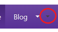
While implementing the split drop-down I had some funny behaviour with the carat where a second icon was appearing next to the real one.

Turns out this was caused by whitespace in the HTML of all things so I had to remove it between some of the tags. I don’t know why this is a problem here as whitespace between tags is usually ignored in HTML but who am I to question the whims programming gods?
<!-- Don't separate the following 2 a classes, whitespace affects css rendering! -->
                        <a href="{{ site.baseurl }}{{ node.link }}" class="nav-link" >{{ node.name }}</a><a class="dropdown-toggle dropdown-toggle-split nav-link dropdown-sm-padding" data-toggle="dropdown" aria-haspopup="true" aria-expanded="false">
<span class="sr-only">Toggle Dropdown</span></a>
There were a few more corrections, including to the hover colour on the drop-down menu. Previously the hover colour meant when you hovered over the text, you could no longer read it which obviously wouldn’t do! After much fiddling, I finally got the navbar (and the whole default layout) looking nicely:

The full navbar code can be found below, I commented out the search bar function for future use, as I don’t really need it at the beginning of this refresh.
navbar.html
<nav class="navbar navbar-expand-md navbar-dark bg-gradient">
    <button class="navbar-toggler" type="button" data-toggle="collapse" data-target="#navbarNavDropdown" aria-controls="navbarNavDropdown" aria-expanded="false" aria-label="Toggle navigation">
        <span class="navbar-toggler-icon"></span>
    </button>
    <div class="collapse navbar-collapse mx-2" id="navbarNavDropdown">
        <ul class="navbar-nav">
        {% for node in site.navbar_list_large %}
            {% if node.name == page.group %}
                {% assign active = 'active' %}
            {% else %}
                {% assign active = nil %}
            {% endif %}
            {% if node.dropdown %}
                <div class="btn-group">
                    <li class="nav-item {{ active }} dropdown-toggle dropdown-toggle-split dropdown-no-padding-left">
                        <!-- Don't separate the following 2 a classes, whitespace affects css rendering! -->
                        <a href="{{ site.baseurl }}{{ node.link }}" class="nav-link" >{{ node.name }}</a><a class="dropdown-toggle dropdown-toggle-split nav-link dropdown-sm-padding" data-toggle="dropdown" aria-haspopup="true" aria-expanded="false">
<span class="sr-only">Toggle Dropdown</span></a>
                        <div class="dropdown-menu">
                            {% for sub in node.dropdown %}
                                <a class="dropdown-item dropdown-light-text" href="{{ site.baseurl }}{{ sub.link }}">{{ sub.name }}</a>
                            {% endfor %}
                        </div>
                    </li>
                </div>
            {% else %}
                <li class="nav-item {{ active }}">
                    <a class="nav-link" href="{{ site.baseurl }}{{ node.link }}">{{ node.name }}</a>
                </li>
            {% endif %}
        {% endfor %}
        </ul>
        <!-- <form class="form-inline my-lg-0">
            <input class="form-control mr-sm-2" type="text" placeholder="Search">
            <button class="btn btn-secondary my-sm-0" type="submit">Search</button>
        </form> -->
    </div>
</nav>
_bootstrap_customisation.scss
.navbar-dark .nav-link {
  color: rgba(255, 255, 255, 0.9) !important;
  text-shadow: 0 -1px 0 rgba(0, 0, 0, 0.2) !important;
}

.navbar-dark .nav-link:hover {
  color: rgba(255, 255, 255, 1) !important;
}

@include media-breakpoint-up(md) {
  .navbar-dark .nav-item.active .nav-link {
    background: #472778; /* Old browsers */
    background: -moz-linear-gradient(bottom, $purple, #472778); /* FF3.6-15 */
    background: -webkit-linear-gradient(bottom, $purple, #472778); /* Chrome10-25,Safari5.1-6 */
    background: linear-gradient(to top, $purple, #472778); /* W3C, IE10+, FF16+, Chrome26+, Opera12+, Safari7+ */
  }
}

.bg-gradient {
  background: $purple; /* Old browsers */
  background: -moz-linear-gradient(bottom, $purple, $purple-light-gradient); /* FF3.6-15 */
  background: -webkit-linear-gradient(bottom, $purple, $purple-light-gradient); /* Chrome10-25,Safari5.1-6 */
  background: linear-gradient(to top, $purple, $purple-light-gradient); /* W3C, IE10+, FF16+, Chrome26+, Opera12+, Safari7+ */
}

.navbar {
  padding: 0 !important;
  line-height: 2rem !important;
}

.nav-link {
  display: inline-block !important;
}

.btn {
  border-radius: 0.5rem !important;
}

li.nav-item.dropdown-toggle.dropdown-toggle-split::after {
  display: none !important;
}

.dropdown-light-text:hover {
  color: $white !important;
}

.dropdown-menu.show {
  background-color: $gray-200;
  border-radius: 0.5rem;
}

.dropdown-no-padding-left {
  padding-left: 0rem !important;
}

.dropdown-sm-padding {
  padding-left: 0.5rem !important;
  padding-right: 0.5rem !important;
}
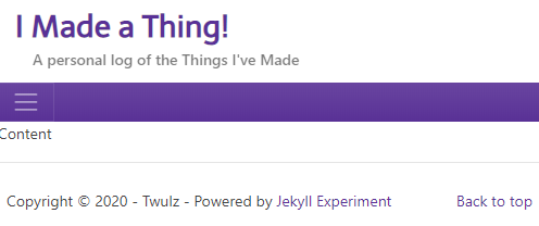
The best part, and a major reason to do this refresh, is that now my navbar is perfectly responsive to small screens and mobile:

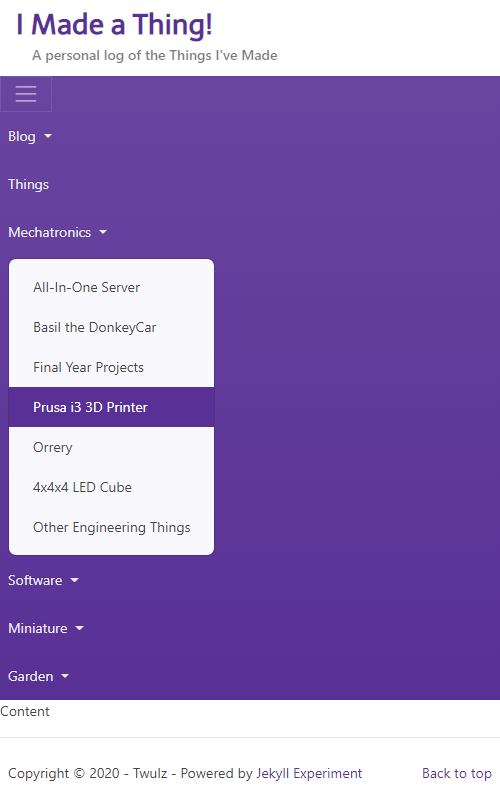
When expanded, the sub-menu also responds appropriately:
